potholes
Gabriel Florit
The following analysis was helpful during the making of my graphic 19,186 potholes in one year and Andrew Ryan’s story, City touts pothole numbers, but what exactly qualifies?.
On the format: each question is followed by the R code that generates the answer. This is also known as reproducible research, a practice that’s slowly being adopted by newspapers (e.g. 538, The Upshot). From wikipedia: “The term reproducible research refers to the idea that the ultimate product of academic research is the paper along with the full computational environment used to produce the results in the paper such as the code, data, etc. that can be used to reproduce the results and create new work based on the research.”
Before we begin: our data has 32011 rows and 45 columns.
Universal assumptions (meaning they apply to all following graphics)
- There are two “date closed” columns, CLOSED_DT and Date.Closed. Not all rows have valid entries for both columns. Since we need one master “date closed” column, we’ll have to use CLOSED_DT unless blank, in which case we’ll use Date.Closed.
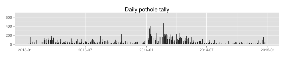
How many potholes were closed per year?
potholes %>%
  filter(!is.na(DATE.CLOSED.R)) %>%
  mutate(YEAR = year(DATE.CLOSED.R)) %>%
  group_by(YEAR) %>%
  summarise(POTHOLES = n()) %>%
knitr::kable()| YEAR | POTHOLES |
|---|---|
| 2013 | 12825 |
| 2014 | 19186 |
What does this look like over time?
data <- potholes %>%
  filter(!is.na(DATE.CLOSED.R)) %>%
  arrange(DATE.CLOSED.R) %>%
  group_by(DATE.CLOSED.R) %>%
  summarise(closures = n())

write.csv(data, file='output/potholeClosuresPerDay.csv', row.names=FALSE)

ggplot(data, aes(DATE.CLOSED.R, closures)) +
  geom_bar(stat='identity') +
  ggtitle('Daily pothole tally') +
  theme(
    axis.title.x = element_blank(),
    axis.title.y = element_blank()
  )
Which districts are contributing to the increase in pothole closures?
data <- rbind(
  (potholes %>%
    filter(pwd_district == '2') %>%
    mutate(district = 'District 2')),
  (potholes %>%
    filter(pwd_district != '2') %>%
    mutate(district = 'Rest'))) %>%
  mutate(YEAR = year(DATE.CLOSED.R)) %>%
  filter(!is.na(YEAR)) %>%
  group_by(district, YEAR) %>%
  tally() %>%
  summarise(increase = diff(n))

write.csv(data, 'output/yearlyIncreaseByDistrict.csv', row.names = FALSE)

ggplot(data, aes(x=district, y=increase, fill=district)) +
  geom_bar(stat='identity') +
  geom_text(aes(label=increase), hjust=1) +
  ylab('potholes fixed') +
  xlab(NULL) +
  theme(
    axis.ticks.y = element_blank(),
    axis.text.y = element_blank()
  ) +
  coord_flip() +
  ggtitle('2014 increase over 2013, by district')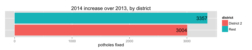
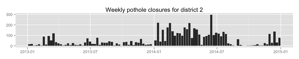
Let’s look at district 2 potholes filled per week.
data <- potholes %>%
  filter(
    !is.na(DATE.CLOSED.R),
    pwd_district == '2'
  ) %>%
  transmute(WEEK = floor_date(DATE.CLOSED.R, 'week')) %>%
  arrange(WEEK) %>%
  group_by(WEEK) %>%
  tally()

write.csv(data, 'output/weeklyClosuresForDistrict2.csv', row.names = FALSE)

ggplot(data, aes(WEEK, n)) +
  geom_bar(stat='identity') +
  ggtitle('Weekly pothole closures for district 2') +
  theme(
    axis.title.x = element_blank(),
    axis.title.y = element_blank()
  )
Let’s look at District 2’s top day of filling potholes.
Graphic-specific assumptions
- We will ignore potholes located at (-71.0587,42.3594), which is City Hall.
district <- 2

data <- potholes %>%
  filter(
    !is.na(DATE.CLOSED.R),
    pwd_district == district,
    LONGITUDE != -71.0587,
    LATITUDE != 42.3594
  ) %>%
  arrange(DATE.CLOSED.R) %>%
  group_by(DATE.CLOSED.R, pwd_district) %>%
  tally() %>%
  group_by(pwd_district) %>%
  slice(which.max(n)) %>%
  inner_join(potholes, by=c('DATE.CLOSED.R', 'pwd_district')) %>%
  filter(
    LONGITUDE != -71.0587,
    LATITUDE != 42.3594
  ) %>%
  select(
    LATITUDE,
    LONGITUDE,
    DATE.CLOSED.R
  ) %>%
  group_by(LATITUDE, LONGITUDE, DATE.CLOSED.R) %>%
  tally() %>%
  ungroup() %>%
  arrange(desc(n))

csv <- data %>%
  select(LATITUDE,LONGITUDE,n)

csv <- cbind(row = rownames(csv), csv)

write.csv(csv, str_c('output/bestDayForDistrict', district, '_', unique(data$DATE.CLOSED.R), '.csv'), row.names = FALSE)

map <- get_map(location=c(min(data$LONGITUDE), min(data$LATITUDE), max(data$LONGITUDE), max(data$LATITUDE)), zoom=13)
ggmap(map) +
  geom_point(aes(x=LONGITUDE, y=LATITUDE, size=n, alpha=0.05), data=data) +
  geom_point(shape=1, aes(x=LONGITUDE, y=LATITUDE, size=n), data=data) +
  scale_size_area(max_size=20) +
  ggtitle(str_c('District ', district, ' fixed ', sum(data$n), ' potholes in ', nrow(data) , ' locations on ', unique(data$DATE.CLOSED.R)))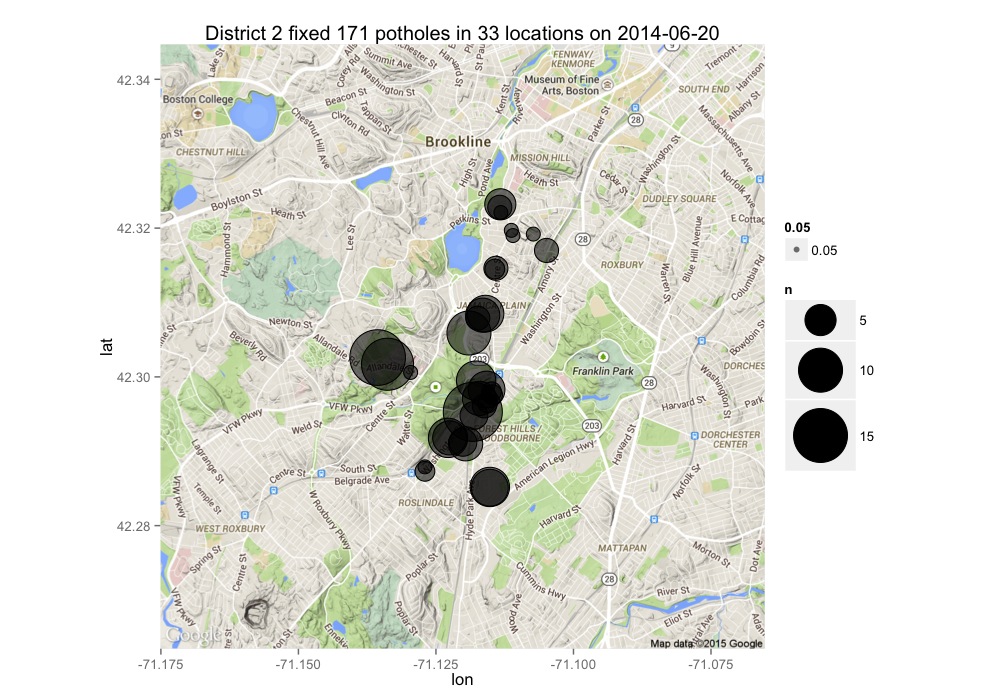
Show me clusters of 15 or more potholes fixed on the same day for all districts for 2014.
Graphic-specific assumptions
- We will ignore potholes located at (-71.0587,42.3594), which is City Hall.
data <- rbind(
  (potholes %>%
    filter(pwd_district %in% c('2', '3')) %>%
    mutate(district = pwd_district)),
  (potholes %>%
    filter(!(pwd_district %in% c('2', '3'))) %>%
    mutate(district = 'Rest'))) %>%
  select(-pwd_district) %>%
  filter(
    LATITUDE!=42.3594, LONGITUDE!=-71.0587,
    year(DATE.CLOSED.R) == 2014
  ) %>%
  group_by(DATE.CLOSED.R, LONGITUDE, LATITUDE, district) %>%
  tally() %>%
  ungroup() %>%
  filter(n >= 15) %>%
  select(-DATE.CLOSED.R) %>%
  arrange(desc(n))

csv <- cbind(row = rownames(data), data)

write.csv(csv, 'output/clustersIn2014.csv', row.names = FALSE)

map <- get_map(location=c(min(data$LONGITUDE), min(data$LATITUDE), max(data$LONGITUDE), max(data$LATITUDE)), zoom=12)
ggmap(map) +
  geom_point(aes(x=LONGITUDE, y=LATITUDE, size=n, alpha=0.05,color=district), data=data) +
  geom_point(shape=1, aes(x=LONGITUDE, y=LATITUDE, size=n), data=data) +
  ggtitle(str_c(nrow(data), ' single-day clusters')) +
  scale_size_area(max_size=15)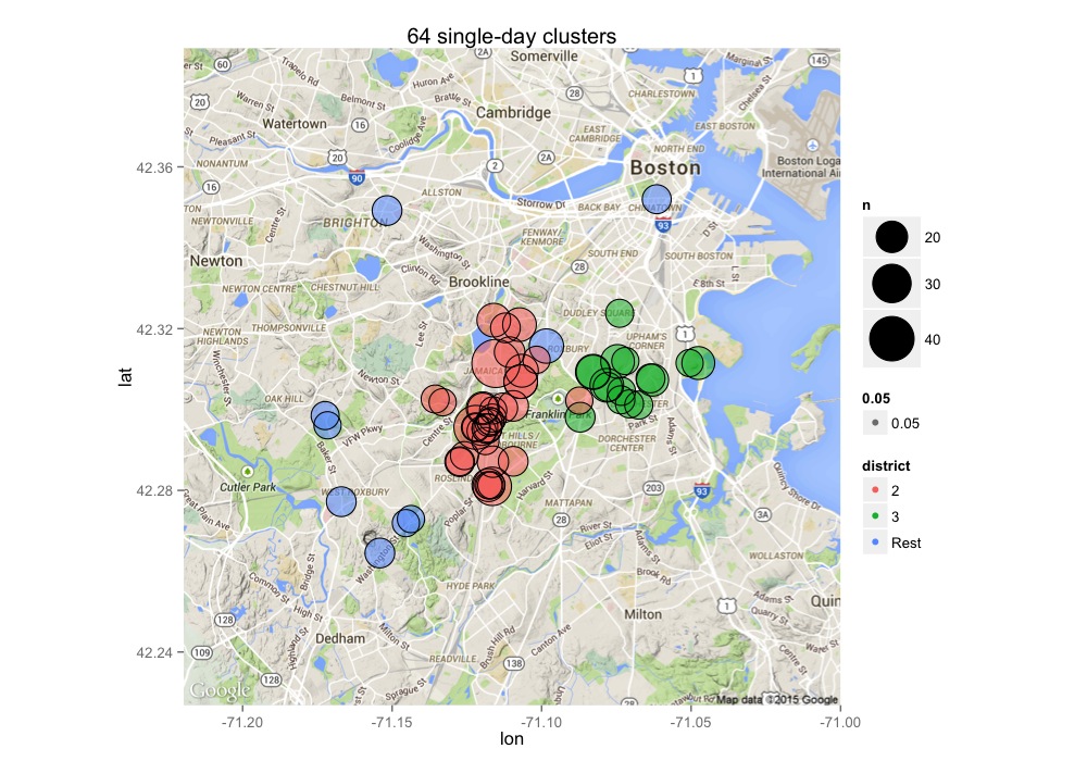
clusters <- data %>%
  group_by(district) %>%
  summarise(count = n())

ggplot(clusters, aes(x=district, y=count, fill=district)) +
  geom_bar(stat='identity') +
  geom_text(aes(label=count), hjust=1) +
  theme(
    axis.ticks.y = element_blank(),
    axis.text.y = element_blank()
  ) +
  coord_flip() +
  ggtitle(str_c(nrow(data), ' single-day clusters'))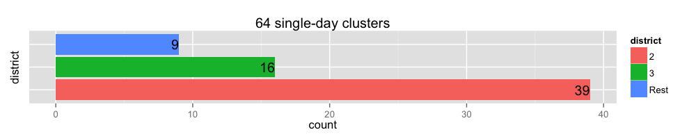
In the above map, what district fixed the cluster near Chinatown, and did they took care of the same location previously?
potholes %>%
  filter(LATITUDE == 42.3520, LONGITUDE == -71.0615) %>%
  group_by(LATITUDE, LONGITUDE, pwd_district, DATE.CLOSED.R) %>%
  tally() %>%
knitr::kable()| LATITUDE | LONGITUDE | pwd_district | DATE.CLOSED.R | n |
|---|---|---|---|---|
| 42.352 | -71.0615 | 1C | 2013-07-05 | 11 |
| 42.352 | -71.0615 | 1C | 2014-07-05 | 17 |